
Microsoft Updates Default Red in Office Apps to Meet Accessibility Standards
Readers help support Windows Report. We may get a commission if you buy through our links.
Read our disclosure page to find out how can you help Windows Report sustain the editorial team. Read more
Microsoft is making a subtle design change in Microsoft 365. The standard red font color in Word, PowerPoint, Outlook, and OneNote is being updated. In the announcement, Microsoft mentioned that the change will improve accessibility and meet web contrast standards.
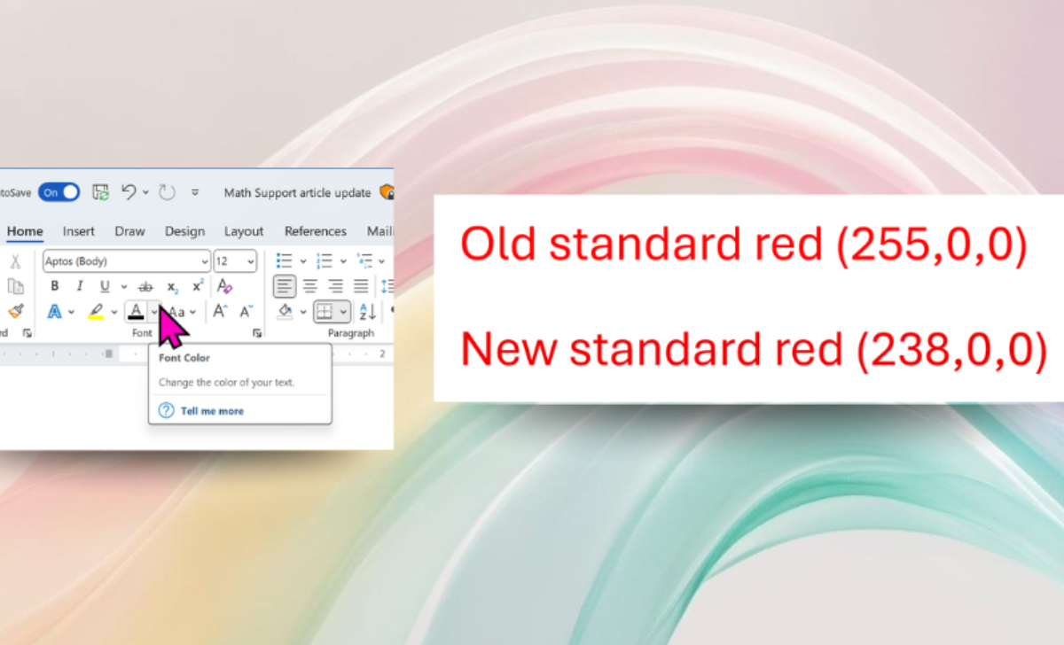
The old red (RGB 255,0,0) was bright and widely used. But it failed to meet the Web Content Accessibility Guidelines (WCAG) for contrast against a white background. This made red text harder to read, especially for people with low vision or color vision deficiencies.

The new red (RGB 238,0,0) is slightly darker. The difference looks subtle, but the contrast is now strong enough to pass WCAG standards. For many users, this makes red text much easier to read. That’s not all; it also ensures red text now passes Microsoft’s built-in Accessibility Assistant tool.
The update is already rolling out. On Windows, it’s included in Version 2411 (Build 18324.20012) or later. On Mac, it comes with Version 16.92 (Build 24120731) or later. Microsoft further says accessibility is a top priority across Office apps, and with small changes like this, the company is making strides forward one at a time.

You can try the new red by opening Word, PowerPoint, Outlook, or OneNote, selecting text, and choosing the standard red from the color picker.