
Chrome for Android tests font and theme options in Reading mode
Chrome Canary for Android adds font, theme, and line spacing options to customize text in Reading mode. The changes are visible without enabling any flags or hidden settings.
We reported on Android Reading mode development in Chrome in April. Google now adds text customization in Chrome Canary.
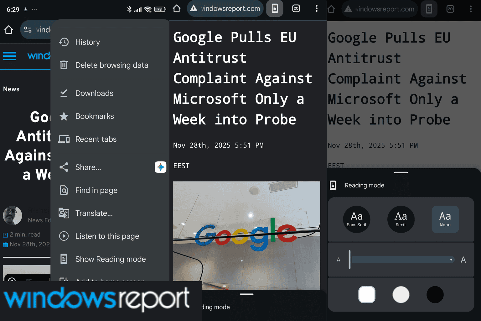
To access the feature, open a webpage and select “Show reading mode” from the Chrome menu. A collapsed panel appears at the bottom. Expanding it displays formatting controls.
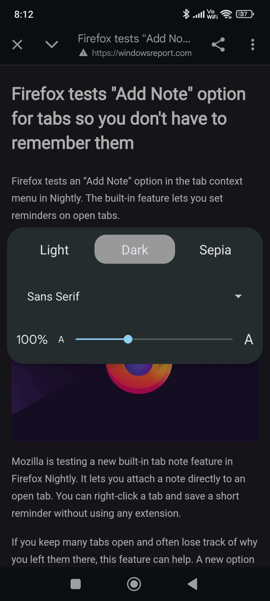
Pick from Sans Serif, Serif, and Mono for font style.
A slider controls text size when the default level feels unsuitable.
Theme options include “Light”, “Dark”, and “Sepia”. These settings support clear viewing during extended reading.
Line spacing can also be changed. Additional or reduced space between lines increases readability. Settings apply only to the current article and reset for each new page that supports Reading mode.
Availability depends on webpage structure. The feature appears only when Chrome identifies the main article content.
In earlier versions, these options were harder to access or required separate apps. Chrome now offers them directly in the browser.
The “Simplified view” feature in Chrome Beta supports basic formatting with limited control. The version in Canary displays a structured layout with clearer presentation of text.
The feature is available in Chrome Canary and has not yet reached other versions.
That’s not all. Chrome on Android now lets you pin tabs. On desktop, Chrome now includes four new themes for Reading mode. Google also tests Mozilla Readability technology for the Reader View feature.
Readers help support Windows Report. We may get a commission if you buy through our links.
Read our disclosure page to find out how can you help Windows Report sustain the editorial team. Read more